Brooklyn Brownstone Renovation
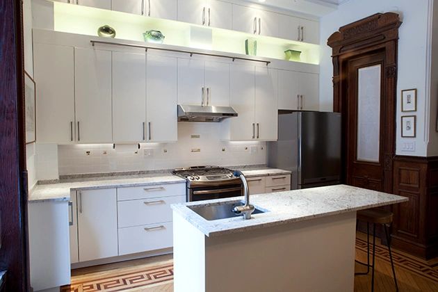
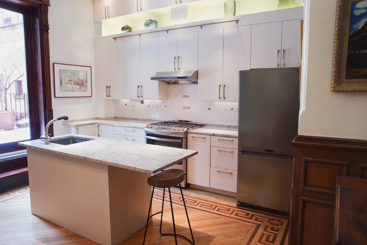
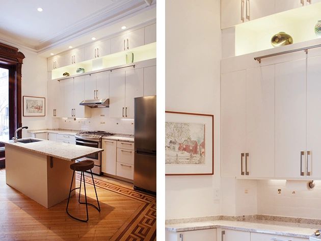
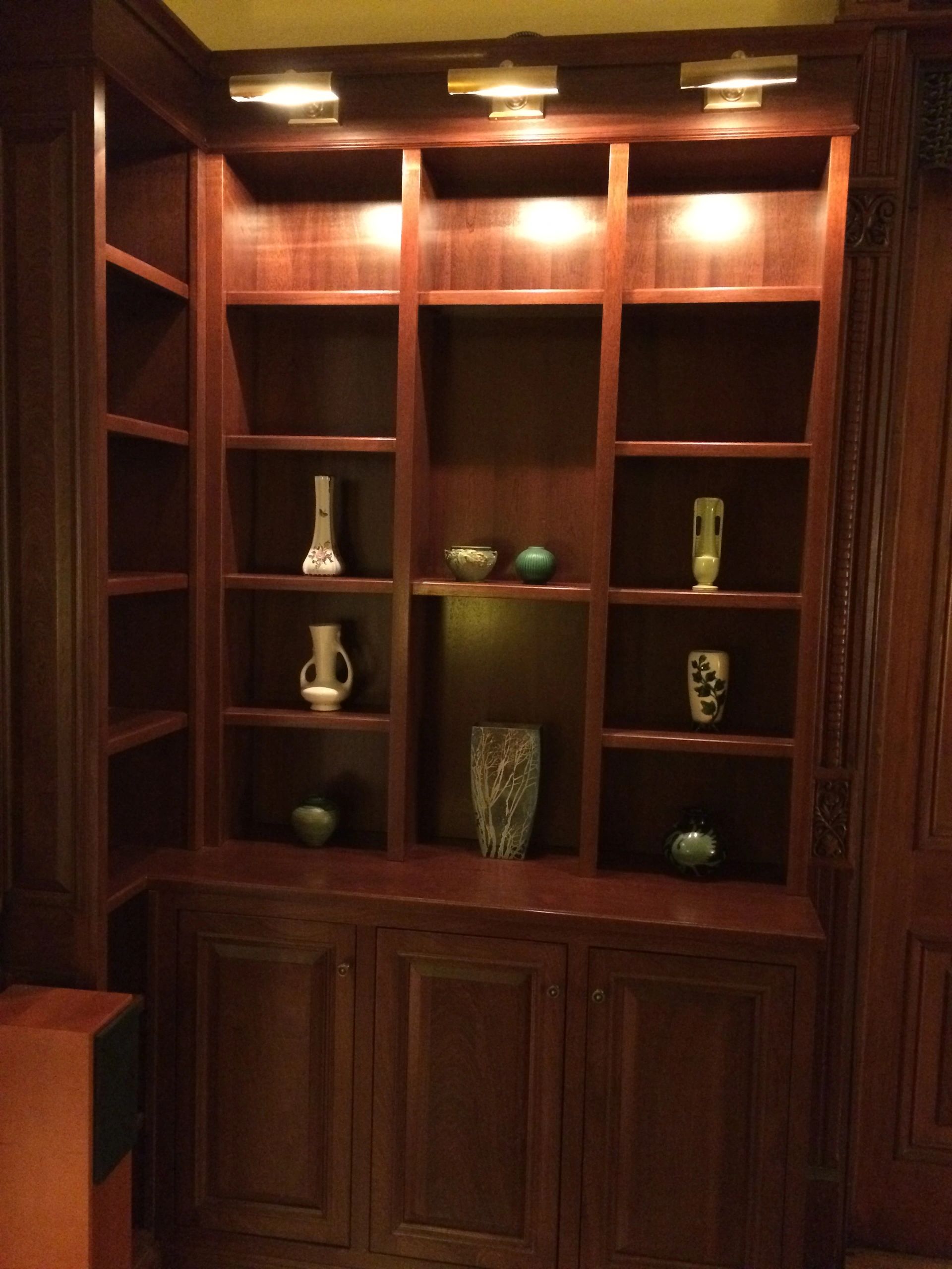
The space was designed to contrast the original Victorian details with modern amenities and details. The result is a well balanced, comfortable family home with striking features. Storage space being a top priority much attention was placed on “finding” closets, shelves. The kitchen boasts ample storage. The challenge was adding a wall of cabinetry without it feeling too sheer and heavy. Adding a backlit, open shelf below the uppermost cabinets adds depth and drama to the wall of cabinets, making the wall lighter and interesting. The library ladder adds interest and easy access to the upper cabinets.
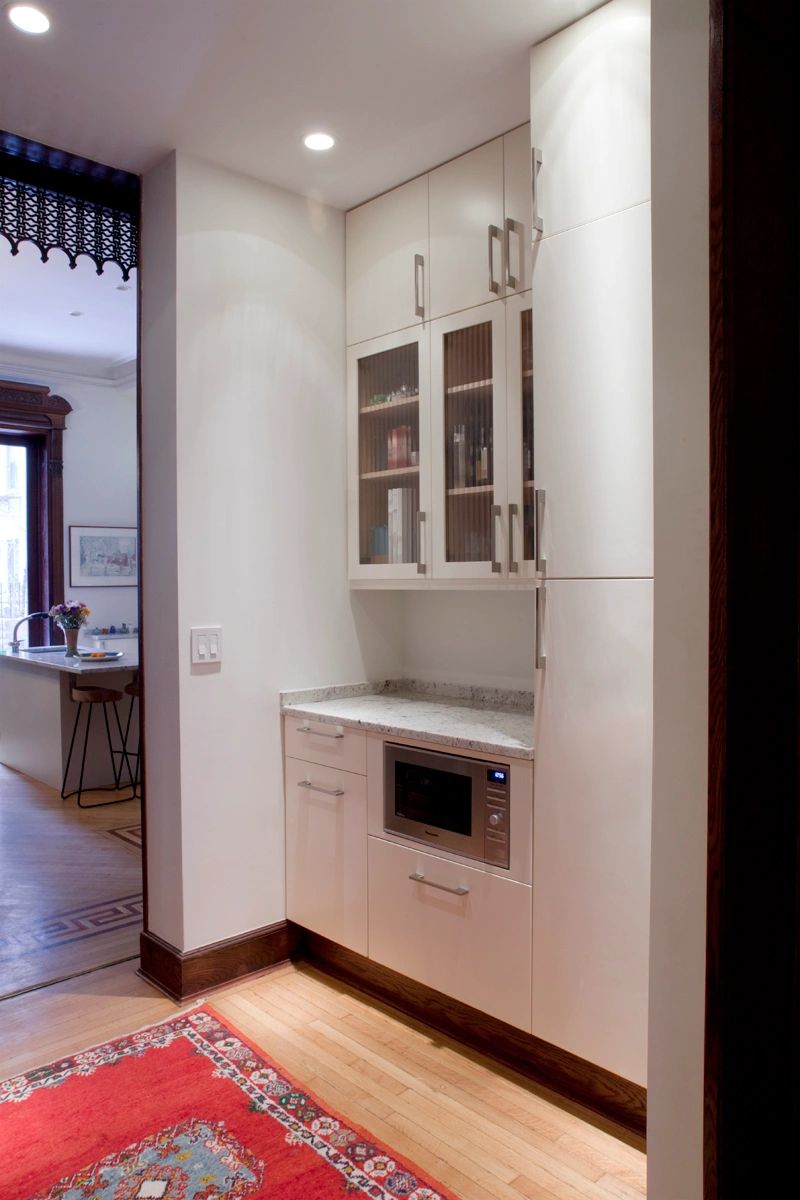
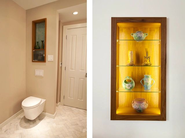
The Parlor floor had no powder room. Taking a few feet from the living room created a hall with a Butler’s Pantry and Powder Room while enhancing the proportions of the living room.
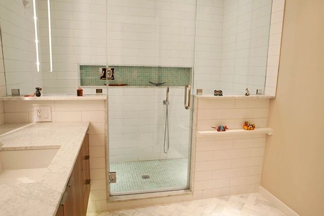
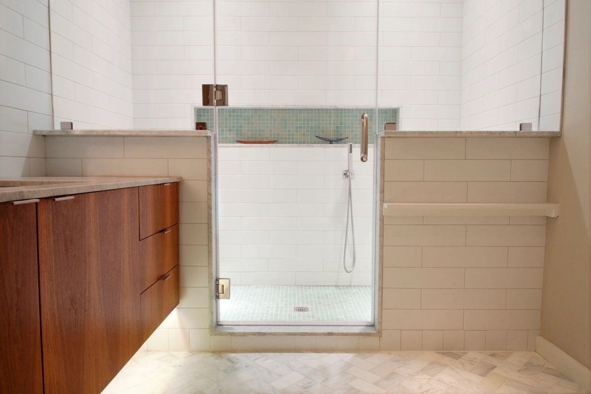
As in most Brownstones, the master bathroom, in the middle of the home, has no windows. Using tile and lighting and a good layout, the space is an oasis with tons of storage.
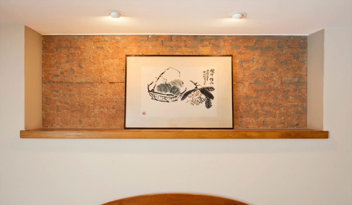
The master bedroom holds many pipes and drains along the outer walls. Hiding them created impressive nooks and niches throughout.
Also, taking space from the long, narrow hallway, the front vestibule was expanded to create a welcoming entrance with plenty of space for coats and boots. This also makes the original hallway seem less narrow. Throughout the home, rooms are now more comfortably proportioned.

Brooklyn Brownstone Renovation
